
The Comparison Graph layers the performance of two or more symbols with an indexed base over a specified period.
Click the Compare icon in the lower left corner of the screen to access the Comparison Graph.

Select Comparison Graph at the top of the screen.

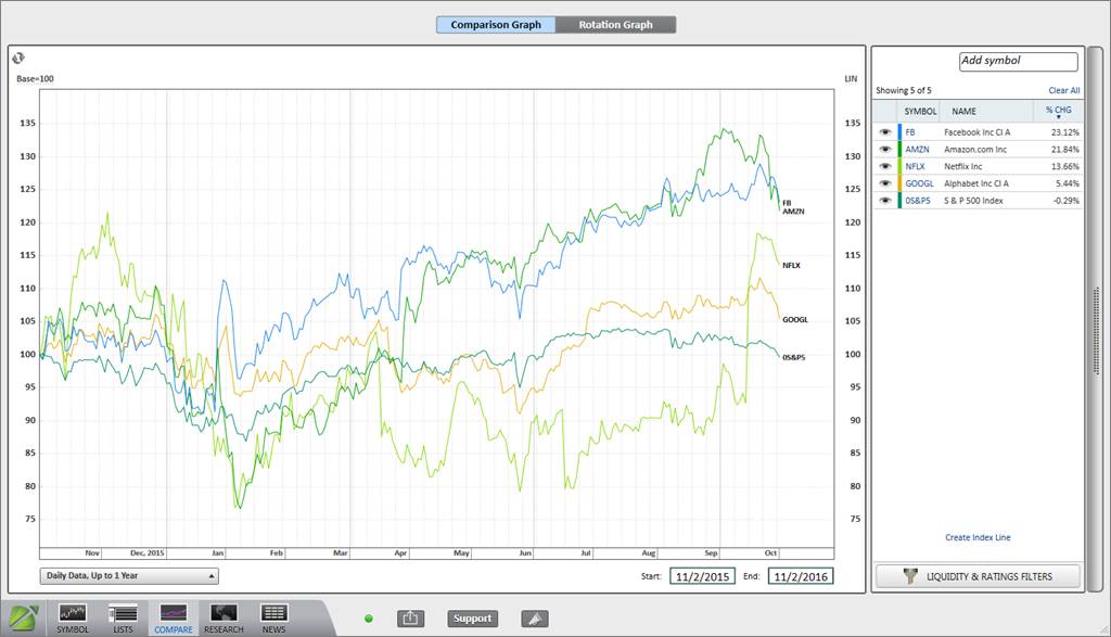

To add a symbol to the Comparison Graph, type a ticker into the white box located in the top right corner of the screen, and hit Enter on the keyboard. To find a ticker symbol, type the company or instrument name into the symbol box to view a list of available options.
Comparison Graphs support active symbol types including:
- Stocks* (US and International)
- Real Estate Investment Trusts (REITs)
- American Depositary Receipts (ADRs)
- Exchange-Traded Funds (ETFs)
- Closed-End Funds (CEFs)
- Indices (US and International)
- Sectors (US, International, Regional, and Global)
- Industry Groups (US, International, Regional, and Global)
- Mutual Funds
- Currencies
- Exchange Rates
- Pre-Initial Public Offerings (IPOs)
*Please note that stocks are plotted on the comparison graph in their local currency.
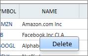
To remove a single symbol from the Comparison Graph, right-click on the name in the Comparison Graph Menu, and select Delete.
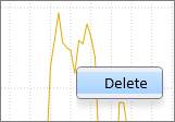
Or right-click directly on the symbol’s performance line on the graph, and select Delete.
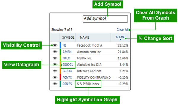
Visibility Control
Symbols may be selectively hidden using the visibility control. Click the eye icon next to a symbol to temporarily hide the corresponding symbol on the graph.

View Datagraph
Click the ticker symbol to view a Datagraph chart.
Highlight Symbol on Graph
Click the name to highlight the single stock or instrument’s performance on the graph. Click and hold the control-key on the keyboard to select and highlight various symbols at once.
% Change Sort
Click % Chg to toggle the symbol sort between ascending and descending order.
Clear All
Click Clear All to remove all the symbols from the Comparison Graph and list.
Add Symbol
Use the search bar to add symbols to the Comparison Graph.
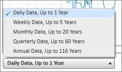
To change the graph’s periodicity, click the periodicity menu in the lower left corner of the screen. Choose between Daily, Weekly, Monthly, Quarterly, or Annual Data.
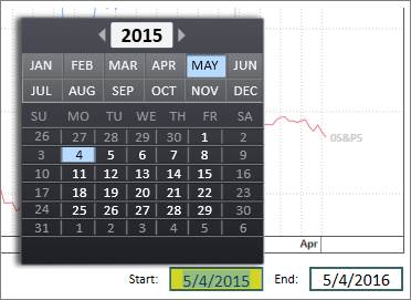
Customize the Comparison Graph’s start and end dates using the buttons in the lower right corner underneath the graph.

Click the date button and type in a specific date, or use the calendar to select a date.
Base
The Base of the Comparison Graph defaults to 100. The index begins at 100 and plots the graph according to its percentage increase/decrease over the determined period.
Click Base=100 in the upper left corner above the graph to toggle to a Base 0 graph.


Scale
The Scale of the Comparison Graph defaults to linear. Click LIN in the upper right corner above the graph to switch to an auto-fit logarithmic graph scale.


Click Create Index Line in the lower right corner of the screen to compile all the symbols in the Comparison Graph Menu into a single indexed line. The result is a price-weighted line based on all symbols in the Menu at the time of creation. It includes symbols that have been filtered out and symbols that are temporarily hidden by the visibility control.
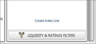
To create
an Index Line, add all the desired symbols into the Comparison Graph Menu, and
then click Create Index Line. Symbols can then be added to the Comparison Graph
to measure individual performance against the customized index.

The index line will begin to draw when all stocks are trading within the selected timeframe. For example, an index line including a recent IPO may be truncated.
Renaming the Index Line
Once an Index Line is created, PANARAY gives the immediate option to rename the customized Index Line. To rename the Index Line after it has been created, right-click on the Index in the Comparison Graph Menu and select Rename.

Click the Liquidity & Ratings Filter button to narrow the scope of the symbols on the graph.
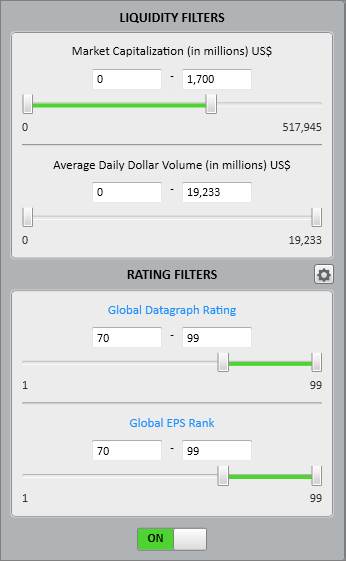
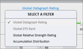
Click the Rating type in blue to view and select different ratings options.
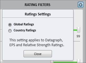
Click the Gear icon next to Rating Filters to choose between viewing Global Ratings or Country Ratings.
Refresh
Click the Refresh icon in the upper left corner of the graph to update it with the most current data.

Print and Email
Click the share icon at the bottom of the screen to print or email the Comparison Graph.
