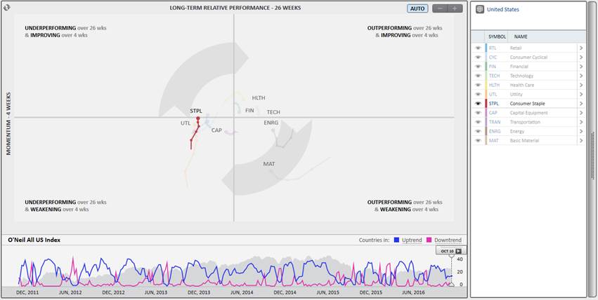
The Rotation Graph shows relative price performance by sector, and then drills down into the constituent industry group performance, and individual stock performance.
Click the Compare icon in the lower left corner of the screen to access the Comparison Graph.
Select Rotation Graph at the top of the screen to view the graph.
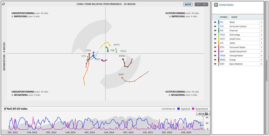
Distance along the vertical y-axis represents short-term, 4-week momentum. Distance along the horizontal x-axis represents long-term, 26-week relative performance. On the graph, each sector/industry group/stock is visually represented by a “tadpole” where the “head” of the tadpole shows the current position on the graph and the “tail” shows the trailing four weeks’ performance. The direction and placement of each tadpole are always plotted relative to the All O’Neil Index (zero axis) first. Then, the tadpoles can be related to one another also based on their direction and placement.
Sectors and industry groups plotted in the Rotation Graph are market-cap weighted. Stocks are plotted on price performance.
The O’Neil All Index is a market-capitalization weighted index encompassing all stocks in the countries covered by the O’Neil Global Focus List products.
Country-specific Rotation Graphs are plotted relative to their respective O’Neil Indices. For example, the Brazil Rotation Graph is plotted relative to the O’Neil All Brazil Index, which contains all stocks in the O’Neil Brazil database.
The Global Rotation Graph is plotted relative to the O’Neil All World Index.
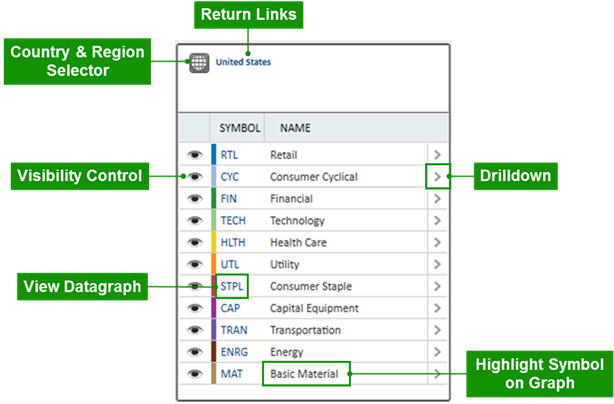
Return Links
When viewing a constituent graph, either at the industry group or stock level, use the blue links at the top of the menu to return to a previous Rotation Graph level.
Country & Region Selector
Click the Globe icon at the top of the menu to choose a Rotation Graph country or region
Visibility Control
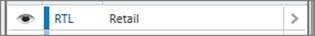
Tadpoles may be selectively hidden using the visibility control. Click the eye icon next to a symbol to temporarily hide the corresponding tadpole on the graph.
View Datagraph
Click the ticker symbol in blue to view a Datagraph chart.
Highlight Symbol Tadpole on Graph
Click the name to highlight the sector, industry group, or stock tadpole on the graph. Click and hold the control-key on the keyboard to select and highlight various symbol tadpoles at once.
Drilldown
Click the arrow to the right of the name to drill down into the constituent Industry Group or Stock Rotation Graph.
Click on a tadpole to highlight it. Click and hold the control-key on the keyboard to select and highlight various tadpoles. Click on the tadpole to remove the highlighting.
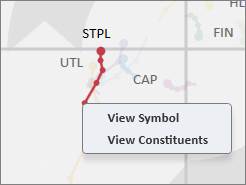
Right-click on a tadpole to View Symbol (Datagraph chart) or View Constituents in another Rotation Graph.
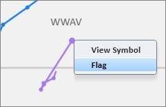
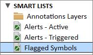
When right-clicking on stock tadpole, there is also an option to Flag the stock. Flagged Symbols are compiled in a special Smart List in List Manager.
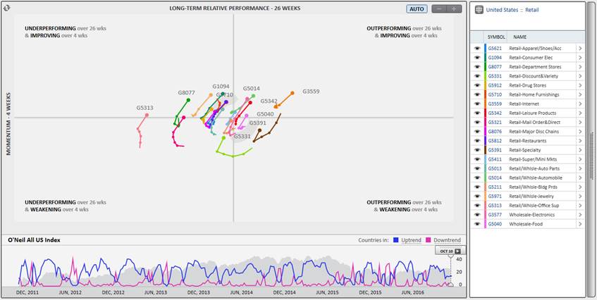
From the Sector Rotation Graph, drill down to see the constituent Industry Group Rotation Graph by clicking on the arrow next to the sector name:
Click on the Industry Group symbol in blue to view a Datagraph chart of the Industry Group.
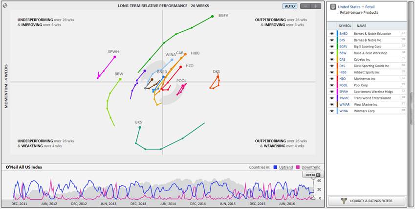
From the Industry Group Rotation Graph, drill down to see the constituent Stock Rotation Graph by clicking on the arrow next to the industry group name:
Click on the symbol in blue to view a Datagraph chart of the stock. Click on the Flag icon next to a stock to flag it to remember or review later.
All Flagged Symbols are compiled in List Manager under Smart Lists:
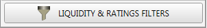
In the Stock Rotation Graph view, click the Liquidity & Ratings Filters button to narrow the scope of the stocks on the graph. Specify thresholds for Market Capitalization, Average Daily Dollar Volume, Datagraph Rating, or EPS Rank.
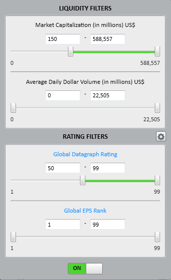
Click the Rating type in blue to view and select different ratings options.
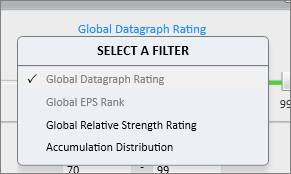
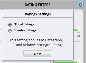
Click the Gear icon next to Rating Filters to choose between viewing Global Ratings or Country Ratings.
Set the filter switch to ON to see the thresholds applied to the Stock Rotation Graph:

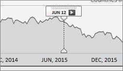
The Rotation Graph Animation plays through the last four years’ performance history to show how the sectors, industry groups, or stocks move in relation to one another.
Click and drag the time scrubber left and right to see historical movement. Click the play button to auto-play through the history and watch the Rotation Graph move through time.
Graph Fit
Click AUTO to toggle between an auto-fit and a percentage fit graph. When the graph is on a percentage fit, use the ( - ) and ( + ) icons to zoom in on or out of the graph.
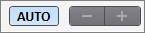
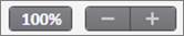
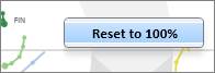
When looking at a zoomed percentage fit graph, return the graph to 100% fit by right-clicking anywhere on the Rotation Graph and clicking Reset to 100%.
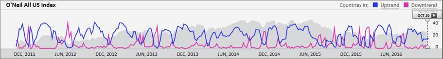
Countries in Uptrend and Downtrend
Check off the Uptrend and/or Downtrend boxes to view a graphic overlay of the number of countries in a downtrend or uptrend.

Refresh
Click the Refresh icon in the upper left corner of the graph to update it with the most current data.

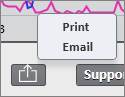
Print & Email
Click the share icon at the bottom of the screen to print or email the Rotation Graph.