The Datagraph™ Tab shows the main Datagraph chart view.

Typing in Tickers
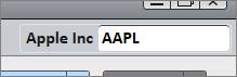
To view a chart, type a ticker symbol into the white box located in the top right corner above the chart and hit Enter on the keyboard. To find a ticker symbol, type the company or instrument name into the symbol box to view a list of available options.
William O’Neil + Co. uses its own symbols, however PANARAY recognizes additional identifiers including SEDOL Masterfile®, Bloomberg™, and Thomson Reuters™.
SEDOL Masterfile® is a registered trade mark of the London Stock Exchange Group Plc.
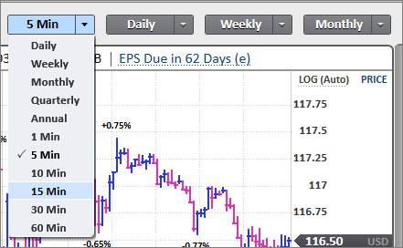
Graph Periodicities
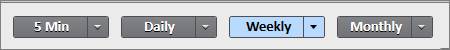
Click on the button of the periodicity to see different graph interval views. The four periodicities default to 5 Minute, Daily, Weekly, and Monthly.
To customize preferred interval views, click the arrow next to the periodicity name and select an interval from the dropdown menu.
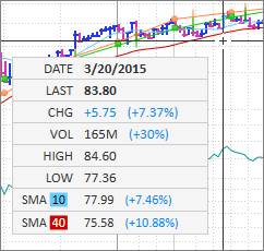
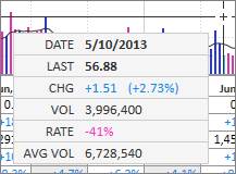
Track Price Box
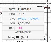
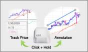
Click and hold the cursor directly on the chart to bring up a Track Price Box. Move the cursor horizontally across the chart to show detailed price and volume action for a specific period.
Price Scale
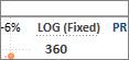
The Price Scale defaults to a fixed Logarithmic scale, denoted by LOG (Fixed) on the upper right side of the chart. Click on LOG (Fixed) to switch to an auto-fit Logarithmic scale indicated by LOG (Auto) or a Linear scale indicated by LIN.
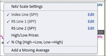
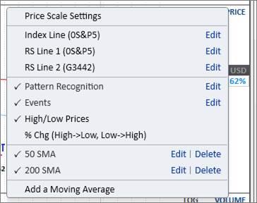
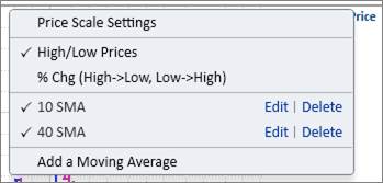
The Price Menu provides a hub to make graphic changes and additions or deletions to the chart.
Click on PRICE in blue at the top right corner of the chart to open the menu:

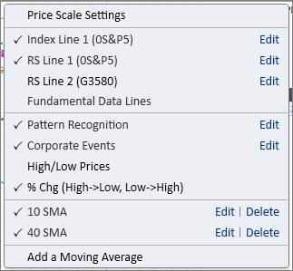
To add a feature to the chart, place a checkmark next it.
To remove a feature from the chart, remove the checkmark.
To edit a feature through the Price Menu, click Edit.
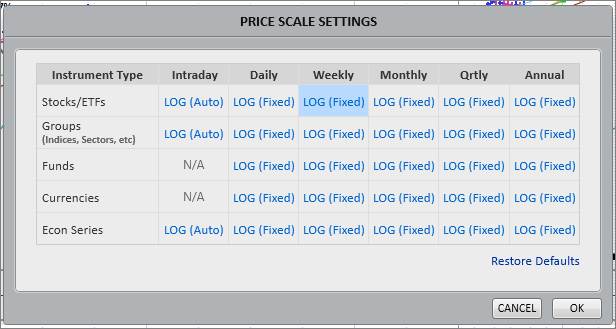
Price Scale Settings
Click on Price Scale Settings to set the price scale for different instruments and periodicities. Choose between a fixed logarithmic, auto-fit logarithmic, or linear scale.
To change a specific price scale, click the scale in blue until the desired option is set:
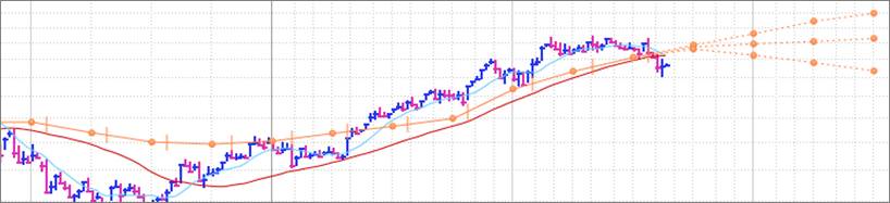
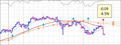
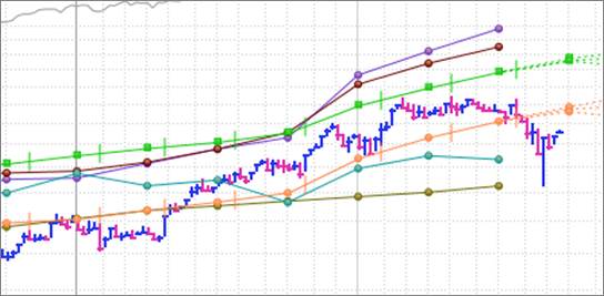
On the orange earnings per share line, the circles plot the sum of the trailing 4-quarters’ earnings, while the vertical hash marks denote when a company’s earnings were announced. The three dotted lines branching out on the right represent the high, consensus, and low Thomson Reuters™ First Call estimates.
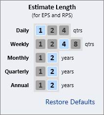
To change how many quarters of estimates are displayed on the Earnings Line, click on the Price Menu and go to Fundamental Data Lines.
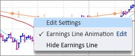
To edit or hide the Earnings Line, go to the Price Menu, or right-click directly on the line:
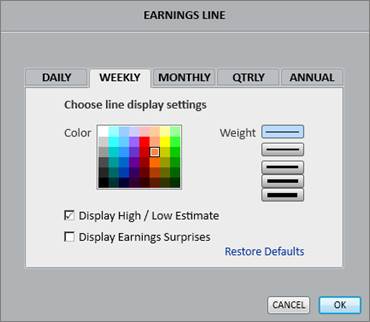
Click Edit Settings to change the line’s thickness and color, add or remove the high/low forward estimates, or display earnings surprises:
Earnings Surprises
The Display Earnings Surprises option in the settings menu will mark earnings surprises directly on the earnings line with blue and pink arrows. Upward blue arrows represent earnings beats, while downward pink arrows represent earnings misses. Hover the cursor over the arrow icon to view a pop-up menu with specific surprise figures.
EPS Scale
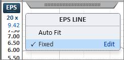
The scale for the Earnings Line is on the left side of the graph. Click EPS/RPS to toggle between the earnings scale and the revenue scale. The orange arrow displays the current trailing 4-quarters earnings value. By default, the Earnings Line is plotted at the best fit EPS multiple.
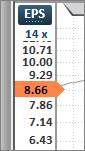
To change the line to a fixed multiple, click on the multiple in blue and select Fixed. The fixed multiple defaults to 20x but may be changed by clicking Edit.
The Earnings Line is temporarily movable by clicking directly on the line and dragging it up or down. Note that moving the line will change the corresponding EPS scale on the left.
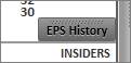
Earnings Line Animation
The Earnings Line Animation plays through the earnings history to show how estimate revisions and earnings surprises relate to a stock’s price performance.
Click on the EPS History button at the bottom right corner of the chart to activate the animation play button.
Press the play button to automate the animation, or manually drag the scrubber horizontally across the chart’s history.
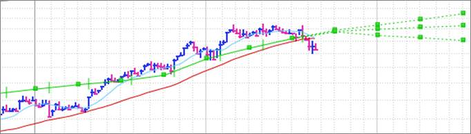
On the green Revenue per share line, the squares plot the sum of the trailing 4-quarters’ revenues, while the vertical hash marks denote when a company’s earnings were announced. The three dotted lines branching out on the right represent the high, consensus, and low Thomson Reuters™ First Call estimates.
To change how many quarters of estimates are displayed on the Revenue Line, click on the Price Menu and go to Fundamental Data Lines.
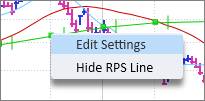
To edit or hide the Revenue Line, go to the Price Menu, or right-click directly on the line:
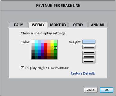
Click Edit Settings to change the line’s thickness and color, and add or remove the high/low forward estimates:
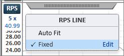
RPS Scale
The scale for the Revenue Line is on the left side of the graph. Click EPS/RPS to toggle between the earnings scale and the revenue scale. The green arrow displays the current trailing 4-quarters revenue value. By default, the Revenue Line is plotted at the best fit RPS multiple.
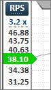
To change the line to a fixed multiple, click on the multiple in blue and select Fixed. The fixed multiple defaults to 5x but may be changed by clicking Edit.
The Revenue Line is temporarily movable by clicking directly on the line and dragging it up or down. Note that moving the line will change the corresponding RPS scale on the left.
In addition to the default Earnings and Revenue lines, there are various other Fundamental Data lines that may be enabled on the chart including:
- Book Value per Share
- Cash Flow per Share
- Earnings Per Share
- Dividend per Share
- Free Cash Flow per Share
- Revenue per Share
To enable Fundamental Data lines on the chart, go to the Price Menu, and then select Fundamental Data Lines. Place a checkmark next to a line to add it to the chart. Click Edit to change a line’s color or thickness.
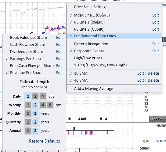
For the Earnings and Revenue lines, customize the Estimate Lengths in this section:
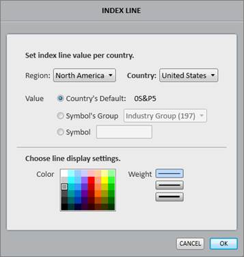
The Index Line is the thin gray line at the top of the graph and defaults to the benchmark for that stock’s trading country. For example, the Index Line for US stocks defaults to the S&P 500®.
Copyright © 2015, Standard & Poor's Financial Services LLC, all rights reserved.
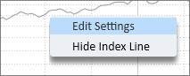
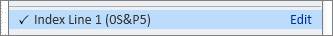
Right-click directly on the line to edit or hide the Index Line:
Click Edit Settings to set a new benchmark for the Index Line for any country. Choose Symbol’s Group to plot a group line instead of an index line as the benchmark. Choose Symbol to manually specify which index to set as the benchmark. To look up the O’Neil symbol for unknown index symbols, use the white ticker search box in the top right corner above the chart.
The Index Line can also be hidden or edited via the Price Menu. In the Price Menu, the text in parentheses denotes the benchmark that is set for the line. Click Edit to set a new index line value for any country.
Please note that the Index Line is typically tied to the Relative Strength (RS) Line, so any changes to the Index may be reflected in the RS Line.
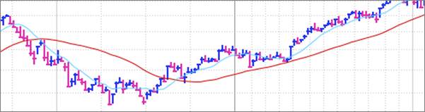
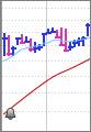
The preset Moving Averages default to red and blue. The red line defaults to the 40-week or 200-day Simple Moving Average (SMA), while the blue line defaults to the 10-week or 50-day SMA.
Right-click directly on a moving average to edit, hide, or create a moving average alert on the line:
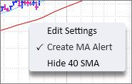
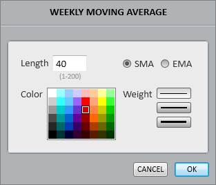
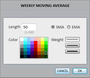
Click Edit Settings to edit the length, color, and thickness of the moving average. Choose between a Simple Moving Average (SMA) and an Exponential Moving Average (EMA):
Click Create MA Alert to be alerted any time the stock crosses over or under the moving average. An alert bell will appear on the left side of the Moving Average (MA) signaling that an alert is active.
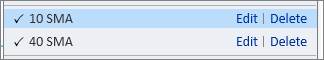
Within the Price Menu, click Edit to change the length, color, or thickness of the Moving Average. Click Delete to remove the Moving Average from the Price Menu options altogether.
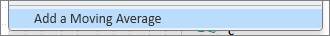
Add a Moving Average
To add a new Moving Average, click Add a Moving Average in the Price Menu.
Please note that moving averages are added based on periodicity. On a Daily chart, the moving average will be delineated in days. On a Weekly chart, the moving average will be delineated in weeks. For example, to add a 150-day moving average to both the Daily and Weekly charts, add a 150-day SMA to the Daily chart, and a 30-week SMA to the Weekly chart.
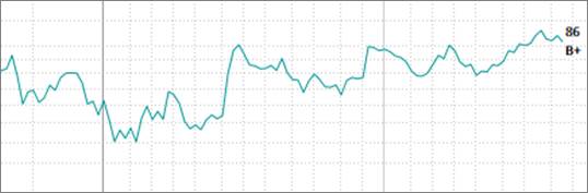
Relative Strength Line 1
The Relative Strength (RS) Line 1 shows the stock’s price performance compared to the Index Line. An upward slope means the stock is outperforming the benchmark, while a downward slope means the stock is underperforming the benchmark.
The number and letter to the right of the Relative Strength Line are the Relative Strength (RS) Rating and the Accumulation/Distribution (A/D) rating, respectively.

To edit or hide the RS Line 1, right-click directly on it:

Click Edit Settings to edit the color and thickness of the RS Line 1, or tie the line to a different index or benchmark. The RS Line 1 benchmark may be customized for each country. This menu also provides an option to add a moving average to the RS1 line or remove the RS Rating and A/D Rating from the end of the line.
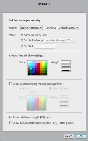
The RS1 Line can also be hidden or edited via the Price Menu. In the Price Menu, the text in parentheses denotes the benchmark that is set for RS1. Click Edit to change the color and thickness of the RS1 Line, or tie the line to a different index or benchmark for each country.

Relative Strength Line 2
The Relative Strength (RS) Line 2 shows the stock’s price performance compared to the rest of its Industry Group.
Enable and Edit the RS Line 2 through the Price Menu.

Click Edit to change the graphic display or change the comparison benchmark to a major industry or sector.

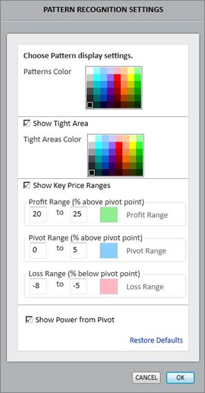
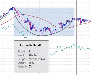
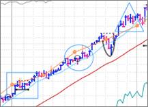
William O’Neil + Co.’s proprietary Pattern Recognition highlights unique base patterns on the Daily and Weekly charts. In addition to identifying the specific base patterns, Pattern Recognition also displays the base count, base depth, pivot point, and key price ranges.
Enable and Edit Pattern Recognition through the Price Menu.

Click Edit to change base colors, edit Tight Areas, edit Key Price Range targets, and customize other Pattern Recognition Settings:
Pattern Hover Report
To see more details on a specific base, place and hold the cursor over a base pattern to view a Pattern Hover Report. Click to lock the report onto the screen while navigating other areas of the Datagraph.
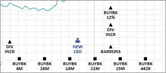
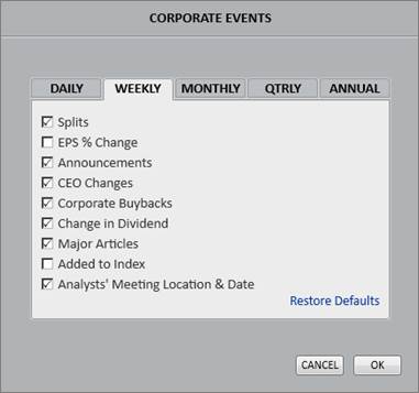
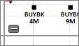
Corporate Event icons populate the bottom of the main price graph and show when significant events such as buybacks, stock splits, or earnings reports have occurred.
Enable and Edit Corporate Events through the Price Menu.

Turn off Corporate Events entirely by removing the checkmark, or click Edit to customize which events to display:
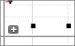
Minimize the events on the chart by clicking the small dash ( – ) sign to the left of the corporate event icons. This keeps the icons accessible on the chart, but temporarily hides the event details.
Click the plus ( +) sign to expand the event details.
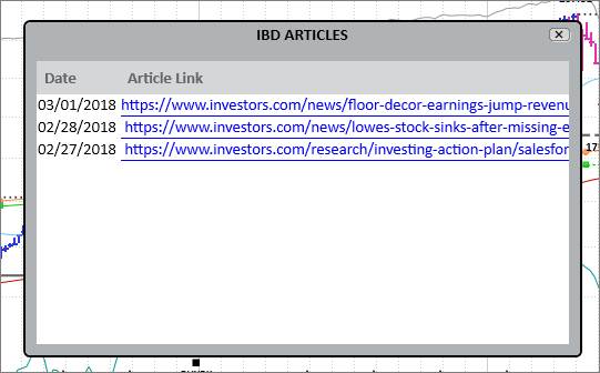
IBD Articles
On the Daily Chart periodicity, there is also an option to enable Investor’s Business Daily (IBD) news articles on the chart in Corporate Events.
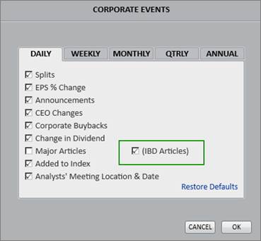
This will display icons for IBD news that link directly to the articles. Click on one of the IBD icons to view a list of recent article links.
CEO Report
The CEO Report appears any time a company has a new CEO. It is indicated by the New CEO icon in the corporate events:

Hover the cursor over the icon to view a snapshot resume that includes the new CEO’s photo, age as of new CEO date, number of shares held, previous key roles, salary, education, and current directorships. Click to lock the CEO Report onto the screen while navigating other areas of the Datagraph.
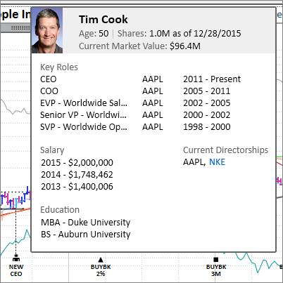
To view the CEO Report, check off CEO Changes in the Corporate Events section of the Price Menu.
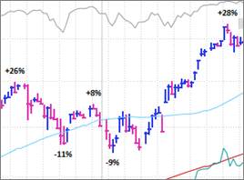
Within the Price Menu, choose to display price percentage changes and/or high and low prices on the chart.
High and low price points, and the associated price percentage calculations, are measured over a 19-period interval. For example, on a daily graph, a high price point is marked on the date where there has been no higher price the nine days prior to that date, and the nine days following that date.
High/Low Prices
Select this option to see High and Low Prices on the chart.

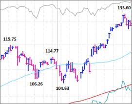
% Chg (High->Low, Low->High)
Select this option to see percentage differences (from high to low and low to high) on the chart.

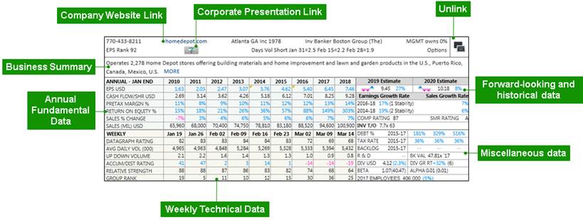
Utilize the blocks to quickly evaluate company financials by viewing data including earnings, estimates, profitability metrics, and proprietary O’Neil Ratings & Rankings.
The Summary Block is a comprehensive compilation of fundamental and technical information.
To open the
Summary Block, click on the gray tab below the company name: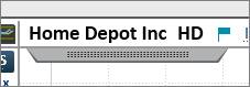
Summary Block Metric Definitions
To view a metric definition, right click on the metric name and click View Metric Definition.

Corporate Presentation Link
William O’Neil + Co. regularly searches company websites looking for the most recent corporate presentations to feed into PANARAY.
Click the Corporate Presentation icon at the top of the Summary Block to open the presentation link:

Unlinking the Summary Block
Click the Unlink icon in the upper right corner of the Summary Block to move, drag, or view the block in a separate window.

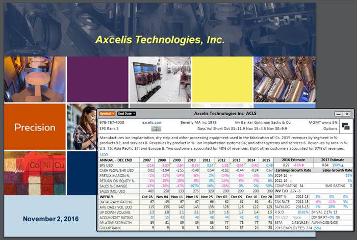
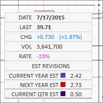
Estimate Revisions
The three triangles in the Estimates box of the Summary Block represent estimate revisions. The triangle on the far right represents the most recent revision, while the prior two represent the past two revisions. Blue upward triangles are upward revisions, while pink downward triangles are downward revisions.
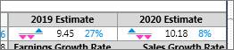
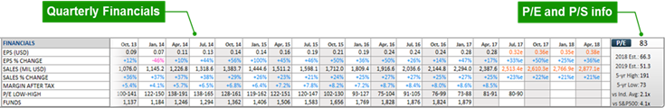
The Financial Block contains customizable and expandable financials that complement the visual data on the chart.
Domestic (U.S.) Financial Block:
The Domestic (U.S.) Financial Block uses non-GAAP data when provided by the companies. Please note that the Fundamentals Tab uses the SEC filings (GAAP) for U.S. traded companies.
International Financial Block:
The International Financial Block and Fundamentals Tab use IFRS figures provided by Thomson Reuters.
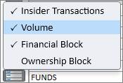
To open the Financial Block, click on the bars icon in the bottom left corner of the Datagraph, and check off Financial Block:
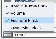
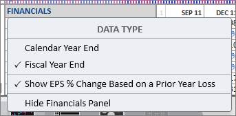
Data Type
To change the data type in the block, click on Financials in the block:
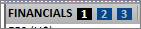
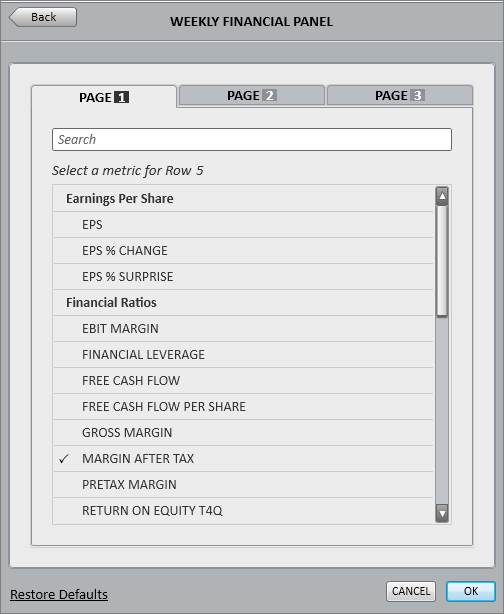
Financial Block Pages
Set and view up to three different Financial Block pages to display the data. Hover the cursor over Financials and click 1, 2, or 3 to switch between the three page options:
Financial Block Sizes
Choose between a small, medium, or large block to display more or less data. Hover the cursor over Financials and click the small, medium, or large block to switch between the three size options:

Customizing the Block
Each data metric in the Financial Block is customizable. Click on the name of any financial metric in the block to open the customization window:
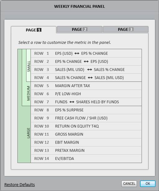
For each of the three pages, customize the metrics for the small, medium, and large block views.
To change a metric, click on it and then choose a replacement metric from the list of options:
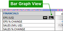
Data Toggle
For certain Financial Block data items such as earnings and sales, there is an option to quickly toggle between the absolute value and the percentage change. Hover the cursor over the item’s name in the block, and click the double arrow icon to toggle between the two types of data.
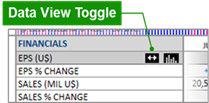
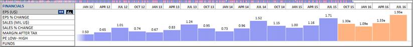
Bar Graph Visualization
Hover the cursor over a data item’s name in the block, and then click the bar graph icon to visualize that data as a bar graph in the block.
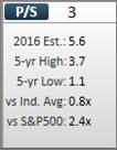
Price/Earnings (P/E) and Price/Sales (P/S)
To the right of the financial metrics is the current P/E Ratio, along with other relevant and comparative P/E data:
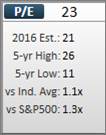
Click on the P/E button to toggle from P/E to P/S data:
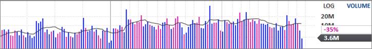
The Volume Block contains volume information that corresponds with the price chart above it. The thin black line going through the volume bars is the 50-day/10-week moving average. The gray arrow on the right shows the current volume, while the percentage shows the volume rate.
To open the Volume Block, click on the bars icon above PANARAY icon on the bottom left, and check off Volume:
Final volume in PANARAY updates after approximately 8:30PM Eastern Time and includes after-hours volume.
Volume Rate
The volume rate measures a stock’s current trading activity in relation to its average trading activity at that point in the day or week.
For example, if a security has traded 1,335,400 shares thus far, the volume rate calculation will compare this volume figure against the 10-week average volume at that point in the trading week. If the 10-week average volume at that point in the trading week is 1,002,200 shares, the volume rate will be 33%. This indicates that the number of shares traded is 33% higher than the 10-week average at this point in the trading week.
For users connected to Nasdaq Basic SM, the volume rate for US stocks is calculated using real-time volume.
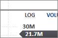
Track Volume Box
Click and hold the cursor over the volume bars to bring up a Track Volume Box. Move the cursor horizontally across the block to show detailed volume action for a specific time.
Volume Scale Settings
To customize the volume scale settings click, Volume on the right side of the block, and then click Volume Scale Settings:

Choose either
a logarithmic (LOG) scale or a linear (LIN) scale for each periodicity and
instrument type: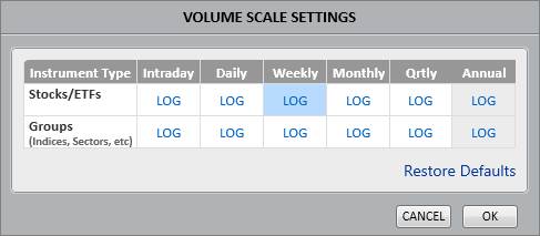
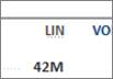
Quickly toggle between logarithmic and linear scales by clicking LOG next to Volume:
Insider transactions show insider buys in blue and insider sells in pink.
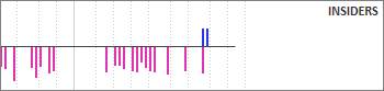
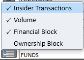
To open Insider Transactions, click on the bars icon above PANARAY icon on the bottom left, and check off Insider Transactions:
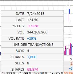
Click and hold the cursor over the date of a transaction to bring up more information as to how many shares were purchased or sold:
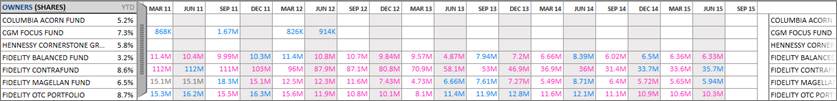
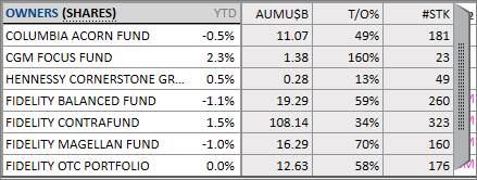
The Ownership Block displays a selection of owners and their level of investment in the stock, as well as their Ownership Rank.
To open the Ownership Block, click on the bars icon above PANARAY icon on the bottom left, and check off Ownership Block:
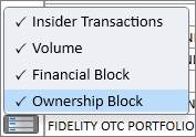
Data Type
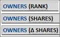
The Ownership Block can be viewed with different types of data including Holdings Rank, Shares Held, or Change in Shares Held.
To toggle between these three options, click on Rank, Shares, or ∆ Shares directly next to Owners.
Or click on Owners in blue and select the preferred setting under Data Type.
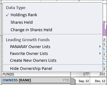
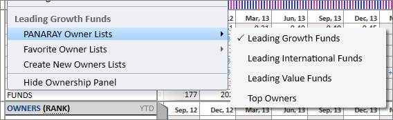
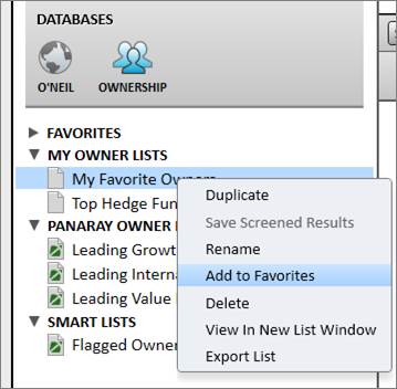
Owner Lists
The list of Owners in the Ownership Block defaults to the preset PANARAY Leading Growth Funds list. This can be changed to a different preset PANARAY Owner List or to a customized Favorite Owner List. To change the Owner List, click Owners in blue and select a new list from the PANARAY Owner or Favorite Owner Lists.
Click Create New Owners Lists to create a new list in the Ownership Database of List Manager.
For an Owner List to appear in the Favorite Owner Lists section, right click on the list in the Ownership Database of List Manager, and click Add to Favorites. The numerical order of symbols in the Favorite Owner List is the order that they will appear in the Block.
Ownership Block Sizes
Choose between a small, medium, or large block to display more or less data. Hover the cursor over Ownership and click the small, medium, or large block to switch between the three size options:
Additional Ownership Data
Click the vertical gray tab to see additional ownership data including assets under management (AUM), turnover ratio (T/O%), and number of stocks held (#STK).
The Chart Heading and Indicator Panels show important company details and provide useful chart overlays.
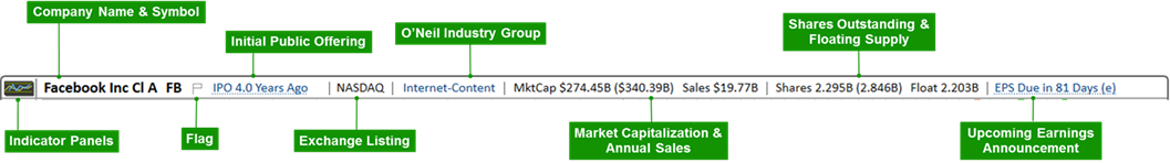
Please note that various items on the chart heading may drop off if space is limited by the size and resolution of the monitor or open PANARAY panels.
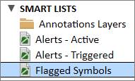
Flagging
Click the Flag icon next to the company name to flag stocks to review later.
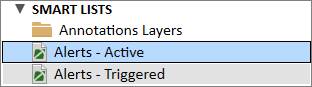
All Flagged Symbols are compiled in List Manager under Smart Lists:
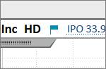
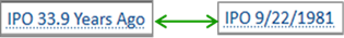
IPO Toggle
Click on the Initial Public Offering (IPO) to toggle between the time since the IPO and the date of the IPO:
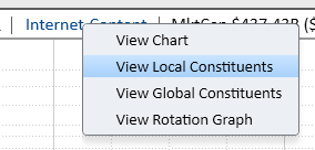
Industry Group Link
Click on the
Industry Group
link to view the Industry Group Chart, view the Local or Global stock
constituents in List Manager, or view the Stock Rotation Graph.

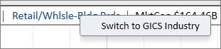
Right-click on the Industry Group link to switch the heading from O’Neil Industry Group to GICS® (Global Industry Classification Standard) Industry Group:
Earnings Report Toggle
Click on the next scheduled earnings report to toggle between the time until the next report and the date of the next report:

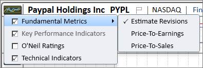
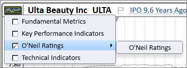
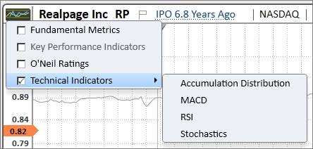
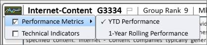
To open the Indicator Panel control, click the small graph icon to the left of the company name.

The Indicator Panel menu contains four groups: Fundamental Metrics, O’Neil Ratings, and Technical Indicators.
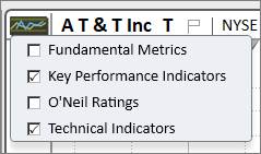
Each of the indicator panel groups has various panel options that can be layered over the main Datagraph view. To enable the indicator panel group, place a checkmark in the respective box.
Hover the cursor over a panel group name to view its options. Place a checkmark next to a specific indicator panel to display it on the chart. It is possible to have multiple indicator panels on the chart at once.
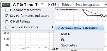
Please note that to view a specific indicator panel on the chart, the associated indicator panel group must also be checked off and enabled.
Removing Panels
To close an indicator panel, remove the checkmark from the Indicator Panel menu, or click the dash ( – ) button to the left of the indicator panel graph.

Removing a checkmark from the indicator panel group will automatically disable all associated indicator panels.
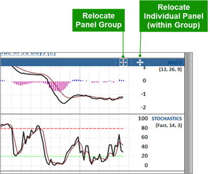
Resizing Panels
To adjust the size of the indicator panel, click and hold the horizontal gray line at the bottom edge of the desired panel, and drag the cursor up or down.
Relocating Panels
To rearrange the vertical order when multiple panels are displayed, hover the cursor over the panel name to the right of the panel graph so that the panel header is highlighted in blue.
To relocate an entire indicator panel group, click and hold the boxed arrow icon. Drag the panel group up or down.
To relocate an individual indicator panel, click and hold the unenclosed arrow icon. Drag the individual panel up or down. Please note that when relocating an individual panel, it may only be moved within its associated panel group.
The Estimate Revisions overlay shows the current year, next year, and current quarter estimate revisions.
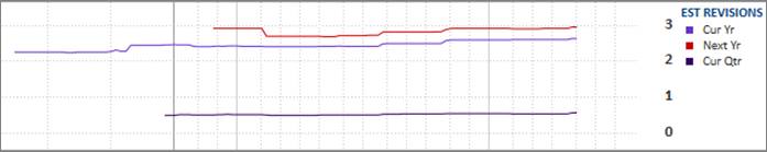
Click and hold the cursor directly on the Estimate Revisions graph to bring up a Track Box. Drag the cursor horizontally across the panel to show the Estimate Revisions details and corresponding price/volume metrics for that specific period.
Click on Est Revisions on the right side of the panel to edit the settings and appearance:
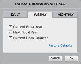
Click Settings to choose which revisions to display for each interval:
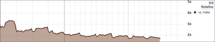
The Price-To-Earnings (P/E) panel tracks changes in P/E with a graphical overlay in relation to price. P/E is calculated on a rolling 4-quarters earning basis. Current and forward-looking P/E values use at least one quarter of EPS estimates in the calculation.
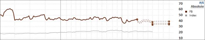
In the Absolute P/E graph, the thick line represents the stock’s P/E, while the thin gray line represents the index’s P/E.
The dotted lines on the right represent the forward-looking estimates. The highest and lowest estimate values are used in the forward P/E calculations to see the potential P/E range.
Click on Absolute/Relative to toggle between the absolute and relative P/E values.


The Relative P/E graph shows the stock’s P/E performance against the index:
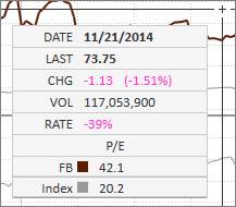
Click and hold the cursor directly on the P/E graph to bring up a Track Box. Drag the cursor horizontally across the panel to show the P/E details and corresponding price/volume metrics for that specific period.
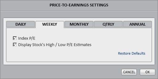
Click on P/E on the right side of the panel to edit the settings and appearance, or learn more about the P/E panel features:
Click Settings to edit the index and estimate visuals:
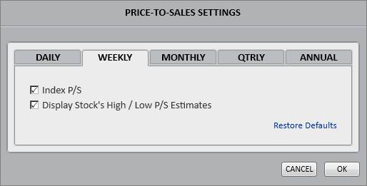
The Price-To-Sales (P/S) panel tracks changes in P/S with a graphical overlay in relation to price. P/S is calculated on a rolling 4-quarters sales basis. Current and forward-looking P/S values use at least one quarter of sales estimates in the calculation. The P/S actual line will only go back 16 quarters.
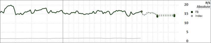
In the Absolute P/S graph, the thick line represents the stock’s P/S, while the thin gray line represents the index’s P/S.
The dotted lines on the right represent the forward-looking estimates. The highest and lowest estimate values are used in the forward P/S calculations to see the potential P/S range.
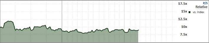
Click on Absolute/Relative to toggle between the absolute and relative P/S values.


The Relative P/S graph shows the stock’s P/S performance against the index:
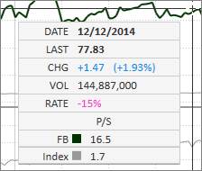
Click and hold the cursor directly on the P/S graph to bring up a Track Box. Drag the cursor horizontally across the panel to show the P/S details and corresponding price/volume metrics for that specific period.
Click on P/S on the right side of the panel to edit the settings and appearance, or learn more about the P/S panel features:
Click Settings to edit the index and estimate visuals:
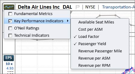
Key Performance Indicators (KPIs) vary from stock to stock. They show pertinent quantifiable measures based on the company’s business and industry.
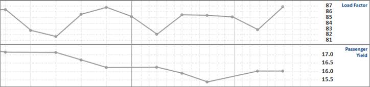
When the KPI indicator panel group is turned on, up to two KPI overlays will automatically display on the Datagraph. These two KPI defaults are determined by relevancy per industry group.
If the KPI option is grayed out in the Indicator Panel menu, then that stock does not have any available KPIs.
Click on the KPI link on the right side of the panel to edit the appearance:
PANARAY KPIs are sourced from 10Q/10K filings. Please note that KPIs are only available for domestic (U.S.) stocks.
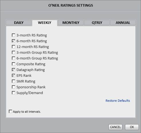
The O’Neil Ratings overlay tracks changes in O’Neil Ratings and Rankings.
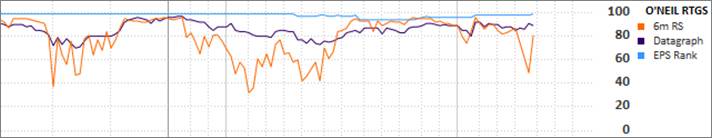
Click and hold the cursor directly on the O’Neil Ratings graph to bring up a Track Box. Drag the cursor horizontally across the panel to show the O’Neil Ratings details and corresponding price/volume metrics for that specific period.
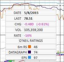
Click on O’Neil Rtgs on the right side of the panel to edit the settings and appearance:

Click Settings to edit and select the ratings that appear in the panel:
The Accumulation Distribution overlay plots the A/D Rating.
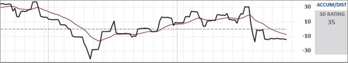
The A/D Rating is a proprietary technical rating that shows where money is flowing by tracking the relative degree of institutional buying (accumulation) and selling (distribution) in a stock over the last 13 weeks. The black line represents the A/D Rating, while the dark red line represents the 20-day EMA.
The A/D rating’s numerical values range from +100 to -100:
A positive rating from +100 to 0 means a stock has been showing accumulation.
Negative ratings from -1 to -10 are neutral.
A rating below -10 indicates a stock under distribution.
The A/D Rating can also be expressed as a letter rating under the following translation:
Greater than or equal to +55 = A+
Greater than or equal to +45 = A
Greater than or equal to +35 = A-
Greater than or equal to +25 = B+
Greater than or equal to +15 = B
Greater than or equal to +5 = B-
Greater than or equal to 0 = C+
Greater than or equal to -5 = C
Greater than or equal to -10 = C-
Greater than or equal to -15 = D+
Greater than or equal to -20 = D
Greater than or equal to -30 = D-
Less than -30 = E
Please note that the A/D rating and graph require a minimum of 44 weeks of price and volume data to appear on the chart. Also, because this is a short-term indicator, this overlay is only available on Daily chart intervals.
Click and hold the cursor directly on the A/D graph to bring up a Track Box. Drag the cursor horizontally across the panel to show the A/D rating and corresponding price/volume metrics for that specific period.
Click on Accum/Dist on the right side of the panel to edit the appearance (line color/thickness), or learn more about the graph. Settings cannot be changed for the A/D Line.
The SD Rating is the Supply/Demand Rating. It is based on the supply demand ratio, which is floating supply divided by the 50-day average daily volume.

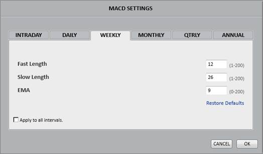
MACD displays the Moving Average Convergence Divergence.
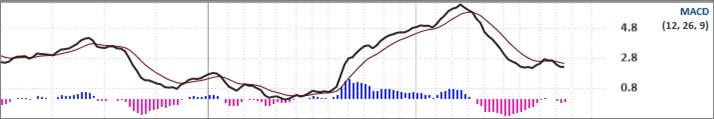
Calculation:
MACD Line (black): (12-day EMA - 26-day EMA)
Signal Line (dark red): 9-day EMA of MACD Line
MACD Histogram: MACD Line - Signal Line
The MACD Line oscillates above and below the zero line, which is also known as the centerline. These crossovers signal that the 12-day EMA has crossed the 26-day EMA.
Positive MACD indicates that the 12-day EMA is above the 26-day EMA. Positive values increase as the shorter EMA diverges further from the longer EMA. This means upside momentum is increasing.
Negative MACD indicates that the 12-day EMA is below the 26-day EMA. Negative values increase as the shorter EMA diverges further below the longer EMA. This means downside momentum is increasing.
Besides these centerline crosses, “signal” line crossovers should also be observed. As previously mentioned the signal line is a 9-day EMA of the MACD Line. A bullish crossover occurs when the MACD turns up and crosses above the signal line. A bearish crossover occurs when the MACD turns down and crosses below the signal line.
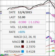
Click and hold the cursor directly on the MACD graph to bring up a Track Box. Drag the cursor horizontally across the panel to show the MACD details and corresponding price/volume metrics for that specific period.
Click on MACD on the right side of the panel to edit the settings and appearance:
Click Settings to change the default MACD settings for each periodicity/interval:
Stochastics is intended to aid in spotting an overbought advance or an oversold decline.
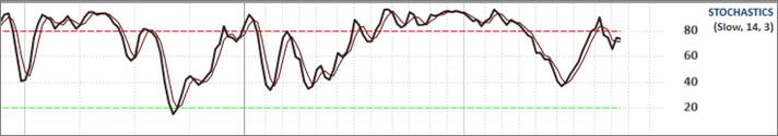
There are three indications that Stochastics can give to warn that a trend may be ending:
1. Reaching an overbought reading or oversold reading. This, however, can last for several periods before a meaningful change is seen.
2. %K crossing down over %D from an overbought level or %K crossing up through %D from an oversold level. At this point, the trend may continue, so technical analysis of price becomes very important.
3. Divergence is seen. A bearish divergence occurs when, at the end of a basing period, a new price high is not confirmed by the Stochastics. A bullish divergence is the inverse of this.
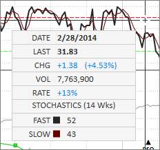
Click and hold the cursor directly on the Stochastics graph to bring up a Track Box. Drag the cursor horizontally across the panel to show the Stochastics details and corresponding price/volume metrics for that specific period.
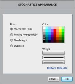
Click on Stochastics on the right side of the panel to edit the settings and appearance:
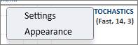
Click Settings to change the default slow and fast Stochastics settings for each periodicity/interval:
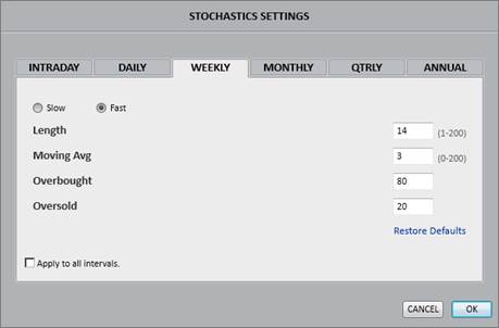
Click Appearance to change the color and thickness of the lines:
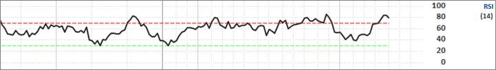
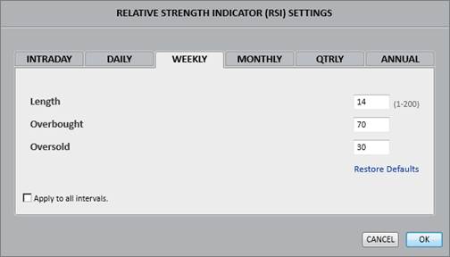
RSI displays the Relative Strength Index (momentum) graph.
The RSI is calculated with the following formula using 14 as the default number of periods (days, weeks or months):
RS = (Summation of the price changes for up days ÷ 14) / (Summation of the price changes for down days ÷ 14)
RSI = 100 – [100 / (1+RS)]
RSI indicators can give the following signals that a trend may be ending:
1. Reaching an overbought or oversold reading.
2. Divergence is seen. A bearish divergence occurs when, at the end of a basing period, a new price high is not confirmed by the RSI. A bullish divergence is the inverse of this.
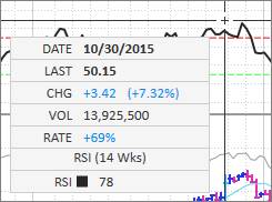
Click and hold the cursor directly on the RSI graph to bring up a Track Box. Drag the cursor horizontally across the panel to show the RSI details and corresponding price/volume metrics for that specific period.
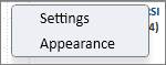
Click on RSI on the right side of the panel to edit the settings and appearance:
Click Settings to change the default RSI settings for each periodicity/interval:
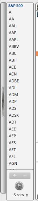
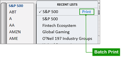
The Mini List is a convenient way to access lists directly from the Symbol View. Use the Mini List to manually scroll or auto-play through stocks in a list.
To open the Mini List, click the vertical gray tab on the left side of the screen. The list that appears will be the most recent list viewed:
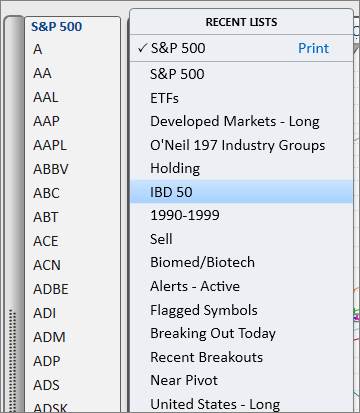
Click the list name in blue at the top of the panel to bring up a selection of recently viewed lists. Click on a list to load it into the Mini List.
To batch print all the Datagraph charts in the list selected, click Print in blue:
To automatically play through the stocks in the list, press the play button at the bottom of the Mini List:

To adjust the auto-play speed, click the up or down arrow next to the selected time.
To manually flip through stocks, press the spacebar on the keyboard.
To add or delete the current stock to/from the selected list, click the (+) or (–) buttons:

To add the current stock to a different list, hit the Insert key. Select My Lists to view other saved lists. Double click on the saved list to add the current stock.
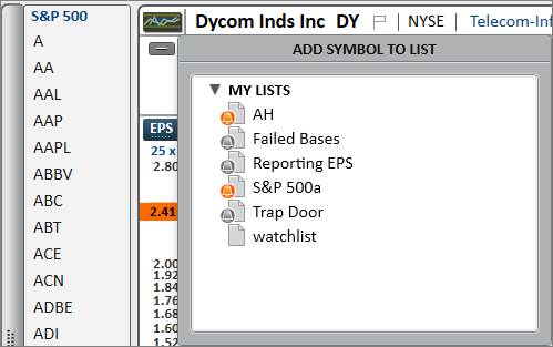
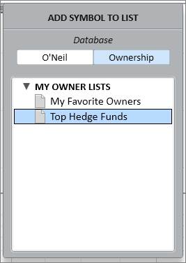
For some symbols such as mutual or exchange-traded funds, the Insert key menu will give the option to add the symbol to a list in the O’Neil Database or the Ownership Database.
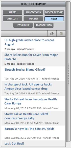
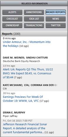
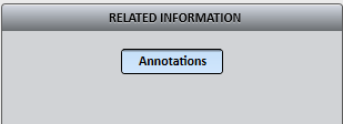
The Related Information (RI) Panel contains tools that assist in stock research, analysis, and portfolio monitoring.
To open the RI Panel, click the vertical gray bar on the right edge of the graph.
Use the Alerts tab to create and monitor active and triggered alerts.
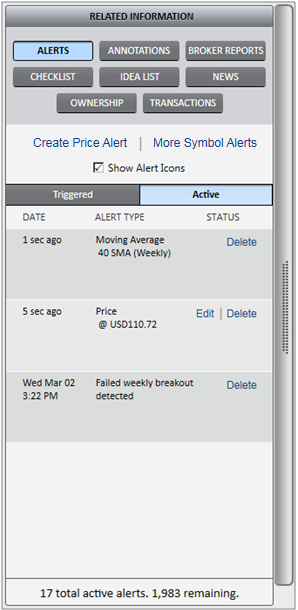
Alerts may be set on price, volume, moving averages, Pattern Recognition, corporate events, and trend lines. Alerts will trigger on converted currency.
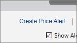
Place a check mark next to Show Alert Icons to show visual alert bells on the chart.
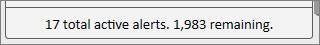
The bottom of the Alerts tab shows information regarding the number of alerts active, and the number of available alerts remaining.
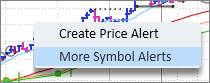
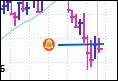
To set a price alert, click Create Price Alert in the RI Panel:
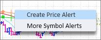
Or right-click directly on the chart and click Create Price Alert:
A box will appear to type in the price alert threshold:
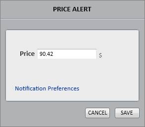
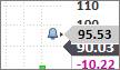
Once a price alert is created, an alert bell will appear next to the price scale showing where the active alert is. Hover the cursor over the bell to see the exact price on the alert:
Modify the existing price alert by clicking the bell and dragging it up or down.
Right-click on the bell to delete the alert.
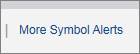
To set daily price change alerts or volume alerts, click More Symbol Alerts in the RI Panel:
Or right-click directly on the chart and click More Symbol Alerts:
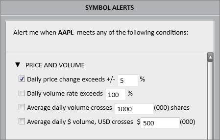
Set various price/volume alerts on specified thresholds:
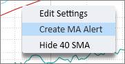
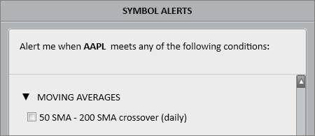
To set an alert for when a stock price crosses a moving average, right-click directly on the desired moving average (MA), and click Create MA Alert:
Once a MA alert is created, an alert bell will appear to the left of the moving average showing that an alert is active:

Right click on the bell to delete the alert.
To set an alert for when two moving averages cross, click More Symbol Alerts in the RI Panel:
Or right-click directly on the chart and click More Symbol Alerts:
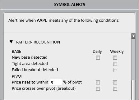
Pattern Recognition alerts can be triggered when a new base is detected, a tight area is detected, a stock approaches the pivot, a stock breaks out from the pivot, or a stock base fails.
To set a Pattern Recognition alert, click More Symbol Alerts in the RI Panel:
Or right-click directly on the chart and click More Symbol Alerts:
Pattern Recognition alerts can be set on the Daily and Weekly charts:
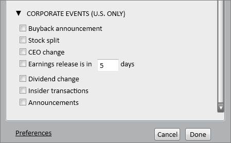
Corporate Event alerts are triggered when significant events occur such as an earnings release or a stock split.
To set corporate event alerts, click More Symbol Alerts in the RI Panel:
Or right-click directly on the chart and click More Symbol Alerts:
Please note that corporate event alerts apply to U.S. stocks only.
Line alerts are set through the Annotations section of the RI Panel.
Select the line annotation option:

There are two ways to set a line alert:
1. Draw a line on the graph, and then right-click directly on the line to Create Line Alert:
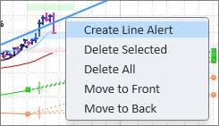
2. Check off the Alert box under line annotations, and then draw a line on the graph:
Once a line alert is created, an alert bell will appear to the left of the line indicating that an alert is active:
Right click on the bell or line to delete the alert.
List Alerts set specific alerts over an entire list of symbols.
Access List Alerts through the Bell icon in List Manager:

Please refer to List Alerts in List Manager for more information on List Alert limits, triggers, and settings.
Triggered Alerts
Once an alert has been triggered, it will appear as triggered in the RI Panel Alerts section and the visual alert bell on the chart will turn orange:
Depending on the specified Notification Preferences, the alert will trigger a pop-up, sound, email, or SMS text.
Message Center
In addition, the triggered alert will generate a notification in the Message Center, denoted by a green badge on the megaphone icon located at the bottom of the graph:

Click the megaphone icon to access the Message Center. In the Message Center, triggered alerts will read as Inactive under the Status column. To reactivate the alert, click Inactive to switch it back to Active. Click the underlined stock symbol in the left column to view its Datagraph chart.
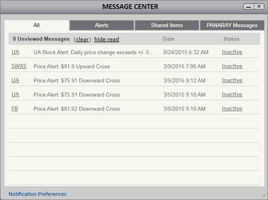
Click Clear to clear out unread messages. Read messages cannot be cleared.
Click Hide Read to hide read messages.
Alerts Lists
Symbols that have active or previously triggered alerts are compiled in List Manager under Smart Lists:
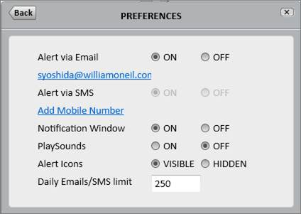
Notification Preferences
Edit Notification Preference settings to choose how to be notified when alerts are triggered.
There are various ways to access Notification Preferences:
1. Go to the PANARAY Menu, go to Preferences, and then click Notifications & Alerts:
2. Right-click directly on the chart, go to More Stock Alerts, and then click Preferences in the lower left corner:
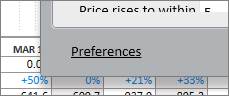
3. Go to the Message Center, and click Notification Preferences in the lower left corner:

Choose to be notified in the application through sounds and pop-ups, or choose to be notified outside of the application through emails and SMS texts. Please note that notifications via email require verification of the address.
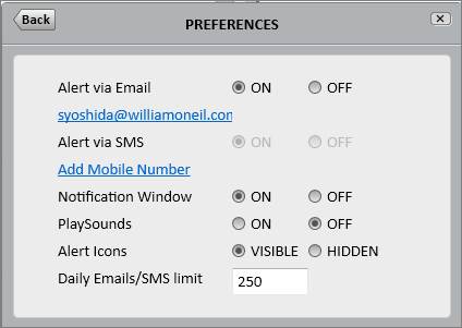
The daily Email/SMS limit defaults to 250 alert messages. The daily maximum limit is 1,000. These limits do not apply to in-app Notifications.
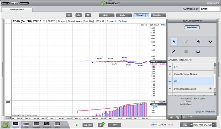
Utilize the Annotations feature to mark up charts and share notes among colleagues.
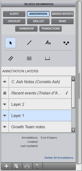
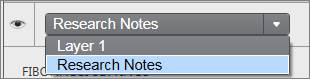
Annotation Layering
Annotation layers are useful for organizing and sharing different sets of notes.
To manage layers, select the cursor:

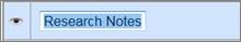
Layers can be selectively hidden using the visibility control. Click the eye icon next to a layer to temporarily turn those annotations off.

All annotations will be saved under “Layer 1” as the default layer. Create a new layer to save a new set of annotations as desired.
To create a new layer, click the plus icon:

To make a copy of an existing layer, click the copy icon:

To delete a layer, click the trashcan icon:

To rename a layer, double click on the layer name
Annotation Sharing
Annotations may be shared between PANARAY users.
To share a layer, select the layer from the menu and then click the share icon at the bottom of the panel:

Click Add Recipient(s) to choose who to share the annotation layer with.
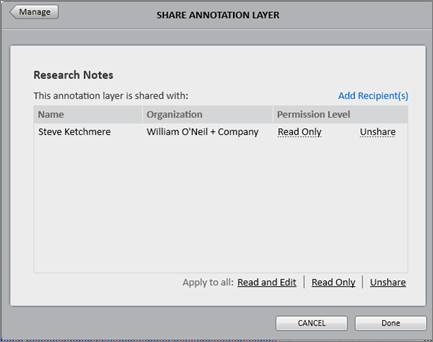
Under the Permission Level column, choose between Read Only and Read & Edit permissions for each shared person. Please note that if the sharer or the recipient makes any changes to Read & Edit annotations, the changes will flow through to all users’ notes.
Once a layer
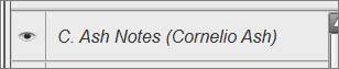
is shared, the sharer will see an icon next to the layer denoting the shared
status. The recipient will see a new italicized layer in their Annotations
section that shows who shared the layer and the permission level.
Sharer:
Recipient:
To add an annotation, select an annotation tool. The annotation tool will stay active until the cursor is selected again.
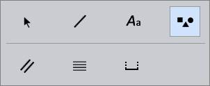
Once an annotation tool is selected, use the dropdown next to the eye icon to choose which layer to add the annotation on:
To draw an annotation, click on the chart. Release the cursor and drag the annotation across the chart to the desired location. Click again to set the annotation.
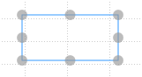
Click and drag an annotation to move it. Click and drag a gray node to edit the shape, direction, or size of an annotation.
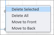
Right click on an annotation to delete the selected annotation, delete all annotations on the chart, or move the selected annotation to the front or back.
Line

Line annotations draw trend lines on the chart.
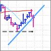
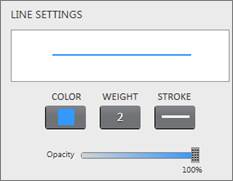
Customize the color, weight, opacity, and style of line annotations.
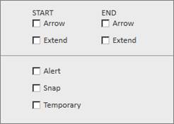
Check off Arrow to add an arrow to the start or end of the line.
Check off Extend to lengthen the start or end of the line across the chart.
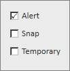
Check off Alert to add an alert to a line.
Check off Snap to draw lines that snap, or attach, directly to the price bars.
Check off Temporary to draw temporary lines that disappear after the chart is refreshed.
Line Pen Annotation Toggle
When not in annotation mode, click and hold the Ctrl key to toggle from the track price cursor to a line annotation. The line annotation toggle is based off the settings checked off in the Line section of Annotations in the RI Panel.
For example, if the Line Annotation in the RI Panel is checked off as Temporary, the Ctrl-key toggle will switch the track price cursor to a temporary line pen. If Alert is checked off, the Ctrl-key toggle will draw line alerts on the chart.
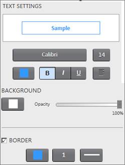
Text Box

Text box annotations create text notes on the chart.
Choose the text font, background, and border of the text box.
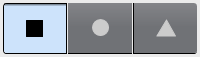
Shapes

Shape annotations draw squares, circles, and triangles on the chart.
Choose the shape type, background, and border.
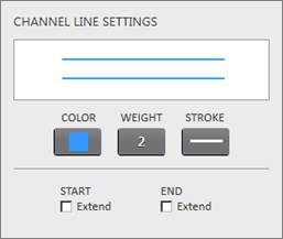
Channel Lines

Channel Lines draw two parallel lines on the chart.
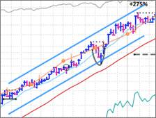
Choose the color, weight, and style of channel lines. Check off Extend to lengthen the start or end of the lines across the graph.
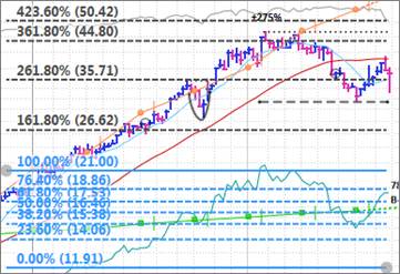
Fibonacci Lines

Fibonacci Line annotations draw horizontal lines divided along the Fibonacci ratios of 23.6%, 38.2%, 50%, 61.8%, 76.4%, and 100%.
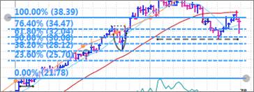
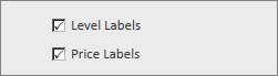
Choose the color, weight and style of Fibonacci lines. Check off Level Labels and Price Labels to view the percentages for the Fibonacci levels and the corresponding stock prices.
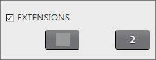
Check off Extensions to view upward extensions of the Fibonacci lines.
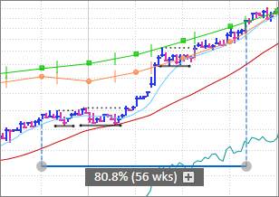
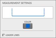
Measurement

Measurement annotations measure a stock’s movement between two specified points in time.
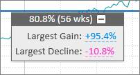
The gray box on the measurement annotation shows the percentage change and time elapsed. Click the plus sign to view more details on the largest gain and largest decline from that period:
Customize the color of the measurement. Check off Leader Lines to view the vertical dotted lines that lead up to the price bars.
First Call Research Direct ™ offer institutional money managers electronic, real-time access to more than 1,000,000 commingled original full-text equity research reports originating from more than 300 leading brokerage firms worldwide with over one year of archived data. With First Call Research Direct ™, clients may access original research reports including all associated charts, graphs, color and artwork.
First Call Research Direct™ is not part of the base PANARAY package. Please contact William O’Neil + Co. for more information about these services.
The Checklist feature profiles a stock against the criteria contained in a Column Set screen. It details exactly which screening metrics the stock does or does not pass through, and shows the passing number as a Checklist Score percentage.
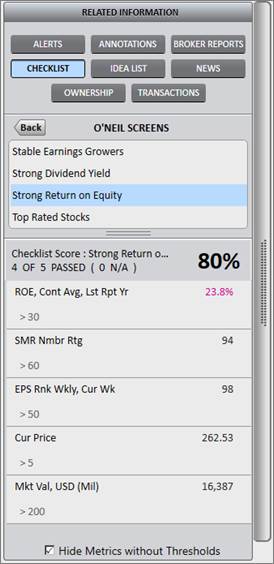
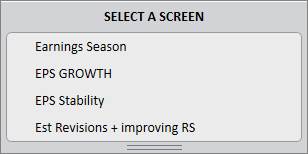
To use checklist, select a screen from the panel.
The selected screen will run the current stock through the screen’s parameters. Each metric is listed with the threshold value underneath. To the right of the metric is the actual value for that stock. Values in pink are those that do not pass through the screen.
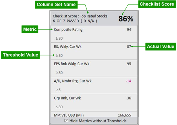
Inapplicable Parameters
By default, individual metrics without thresholds or those that are not applicable are not included in the score. Uncheck “Hide Metrics without Thresholds” to show all metrics regardless of applicability.
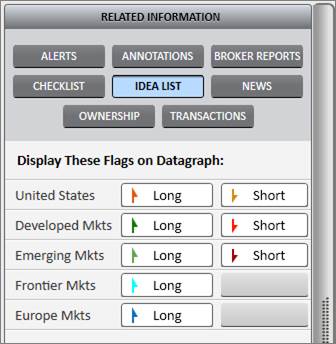
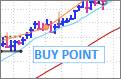
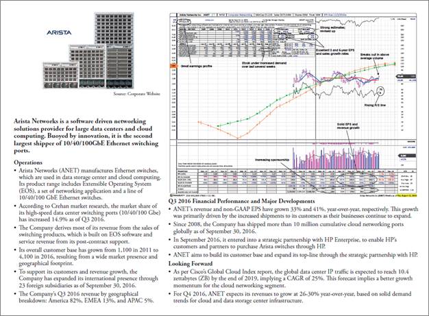
The Idea List feature shows all available Global Focus List (GFL) flags. Click on the button in the panel to show both the GFL flag and the GFL button on the Datagraph chart.
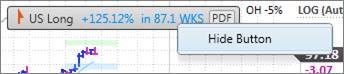
When a stock is added to a GFL, it is denoted by a flag on the price chart and a button at the top of the chart.
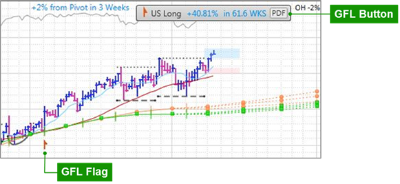
The GFL button shows which focus list the stock is on, as well as the stock’s performance since being added to that list.
The GFL button also includes a PDF Link to the detailed analysis of the Datagraph and company’s operations. Click PDF to view the report:
To temporarily hide the GFL button, right-click on it and hit “Hide Button”:
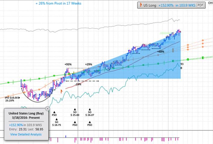
The GFL flag on the price chart shows where the stock was added to the list:

Hover over the flag on the chart to see a GFL Hover Report along with a shaded wedge highlighting the stock’s movement since its addition to the list. Click to lock the report onto the screen while navigating other areas of the Datagraph. Click View Detailed Analysis in blue to view the PDF Link.
*The Idea List feature is only available to those who are entitled to William O’Neil + Co. research. Please contact William O’Neil + Co. for more information about these services.

The News feature provides a stream of third party news articles relating to the stock.
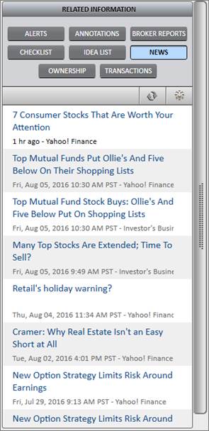
To update the feed, click the refresh icon:

The Ownership feature shows the top funds that own the stock, the stock’s percentage of the fund’s portfolio, and the number of recent shares held by each fund.
An increase in the number of shares is denoted by a blue upward arrow, and a decrease in the number of shares is denoted by a pink downward arrow.
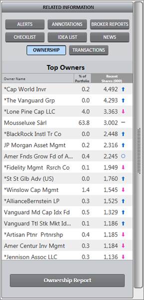
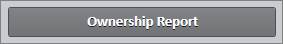
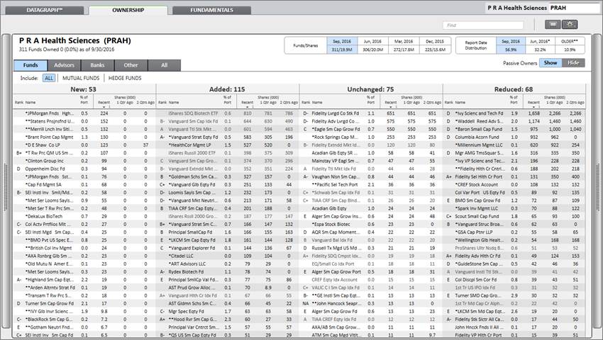
Click the Ownership Report button at the bottom of the panel to open the Ownership Tab with additional details about owners and the status of their positions.
The Transaction feature is associated with the William O’Neil Portfolio Utility tool. When the Portfolio Utility upload is set up within a client firm, it will send portfolio holdings to William O’Neil + Co. to post in Panaray.
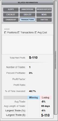
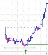
Buy and sell transactions can be added to the portfolio upload file as well. Those will appear on the graph as a green arrow. In addition, Position, Transaction and Average Cost information will update in the RI Panel.
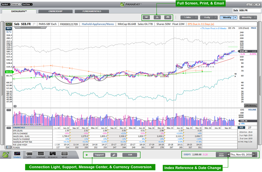
Full Screen

Use the Full Screen button to maximize chart size on the monitor.

Use the Print button to print the current Datagraph view. If the Summary Block is required, open it before printing.
To batch print an entire list of Datagraph charts, use the vertical gray bar on the left side of the screen to open the left panel Mini List. Click on the List header at the top, and then click Print.


Use the Email button to share the Datagraph with others.
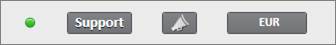

The Connection Light shows the status of the quote and server connection.
Hover over the connection light to get more information on the quote source and connection status.

During market hours for users connected to NASDAQ Basic SM real-time quotes, the connection light will be green or red based on a successful connection to the NASDAQ Basic SM stream.
Outside of market hours, and for users not connected to NASDAQ Basic SM or using DDE, the connection light will be green or red based on a successful connection to the linked server.
To edit Quote Service Provider settings, go to Preferences in the PANARAY Menu.
For access to NASDAQ Basic SM real-time quotes in PANARAY, please contact William O’Neil + Co.

William O’Neil + Co. Institutional Client Services is available 24/7 to address any questions or problems.
Click the Support button to either send an email to the support group, or live chat with someone in Client Services directly through PANARAY.
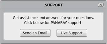
Live Support is only available during business hours.

The Message Center compiles all PANARAY messages into one spot.
When a new message comes through, a green badge will appear on the megaphone icon signaling the number of unread messages.

To clear out unread messages, click Clear.
To hide read messages, click Hide Read.
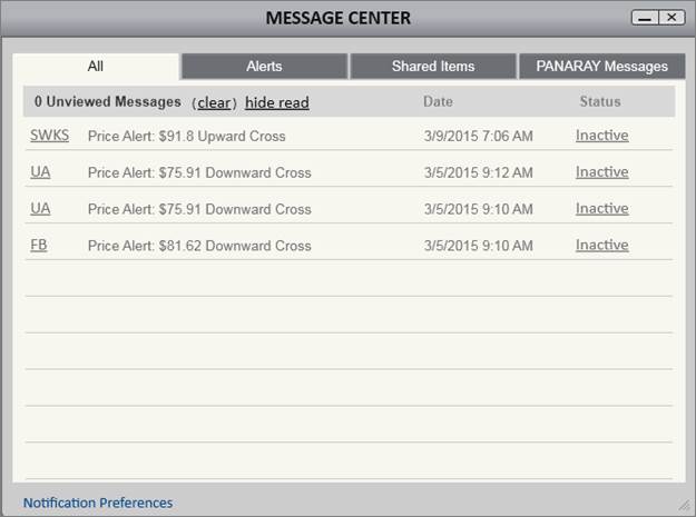
Message Types
Alerts
Any time an alert is triggered, it will appear in the Message Center. Click the stock symbol to go to the Datagraph chart of that triggered alert.
Once triggered, the alert Status column will read Inactive. To reactivate the alert, click Inactive to switch the Status to Active.
Shared Items
Any time an item is shared through PANARAY, it will generate a notification in the Message Center.
Potential Shared Items include lists, column sets, and annotation layers.
PANARAY Messages
PANARAY Messages are from William O’Neil + Co. or the PANARAY Team and typically relate to available upgrades, important feature updates and scheduled maintenance.
Notification Preferences
To edit Notification Preferences, click Notification Preferences at the bottom of the Message Center, or click Preferences in the PANARAY Menu. Choose to be notified in the application through sounds and pop-ups, or choose to be notified outside of the application through emails and SMS texts. Please note that notifications via email require verification of the address.
The daily Email/SMS limit defaults to 250 alert messages. The daily maximum limit is 1,000. These limits do not apply to In App Notifications.
By default, the Datagraph shows relevant metrics in the stock’s local currency. Click the Currency Conversion button to toggle between a stock’s local currency and the designated preferred currency.
Designate a preferred currency by going to Preferences in the PANARAY Menu, and selecting Currency Conversion.
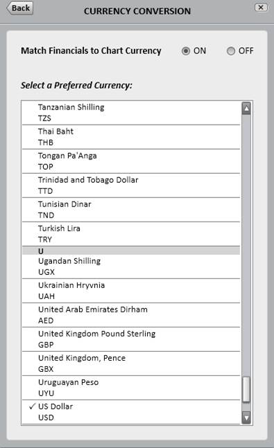
The Currency Conversion menu also includes a setting to always match the Financial Block metrics to the chart currency.
Please note that alerts will trigger on converted currencies.
Index Reference Symbol
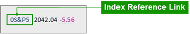
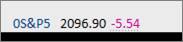
On the bottom of the chart is an index reference symbol.
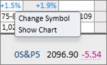
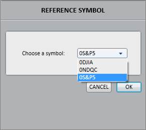
Click on the index symbol in blue to either change the default symbol, or show the chart of the index:
Choose between different options for the index reference symbol:
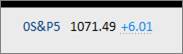
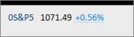
Price Change Options
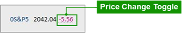
To navigate between the daily value change and the percentage change of the index, click on the blue or pink number:
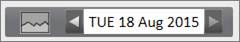
Change Date
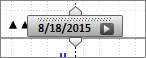
The change date feature changes the end date of a chart and shows the metrics as of that day.
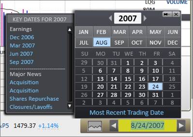
Click on the date in the bottom right corner to change the date. Type in a specific end-date, or use the arrows and buttons to specify calendar years, months, and days.
This section also provides Key Dates. Click on one of the key date links to view the chart when a significant event occurred.
To return the chart to the current date, click Most Recent Trading Date in blue.
Mountain Chart

Click the mountain chart icon to see a company’s major events.
Click and hold on the gold mountain chart area, and then drag left or right to scroll through the chart’s history. The unshaded area on the right side of the mountain chart corresponds with the time frame of the Datagraph’s current view.

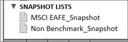
Snapshots
Snapshots save historical Datagraphs with a specific chart end date. To create and save a Snapshot Datagraph, use the Change Date or Mountain Chart to find the preferred chart end date, and then hit the Insert key. Double click on a Snapshot List to add the current stock Snapshot.
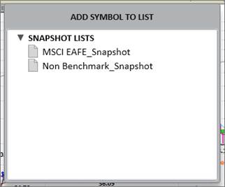
Snapshots will be added to the Snapshot Lists section within List Manager.
Hot Keys are a quick and efficient way to navigate the Datagraph using only the keyboard.
|
Hot Key |
Action |
|
F1 |
5-Minute Chart/First Periodicity |
|
F2 |
Daily Chart/Second Periodicity |
|
F3 |
Weekly Chart/Third Periodicity |
|
F4 |
Monthly Chart/Fourth Periodicity |
|
F5 |
Flag/Unflag Stock |
|
F7 |
Ticker search box |
|
F8 |
Open/Close Ownership Block |
|
F9 |
Open/Close Financial Block |
|
F10 |
Open/Close Summary Block |
|
F11 |
Full Screen |
|
Insert |
Insert Current Stock to a List |
|
Space |
Flip to Next Stock in List |
PANARAY charts various instruments including Stocks, Mutual Funds, ETFs, Closed-End Funds, Currencies, Groups, Sectors, Futures, Cash Spots, and Indices. The Smart Datagraph recognizes the distinctions between these instruments, and optimizes the view based on which is being charted.
The Mutual Fund Datagraph is optimized to view mutual funds in PANARAY.
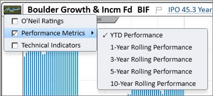
The default view shows a year-to-date (YTD) performance bar graph over a net asset value (NAV) chart.
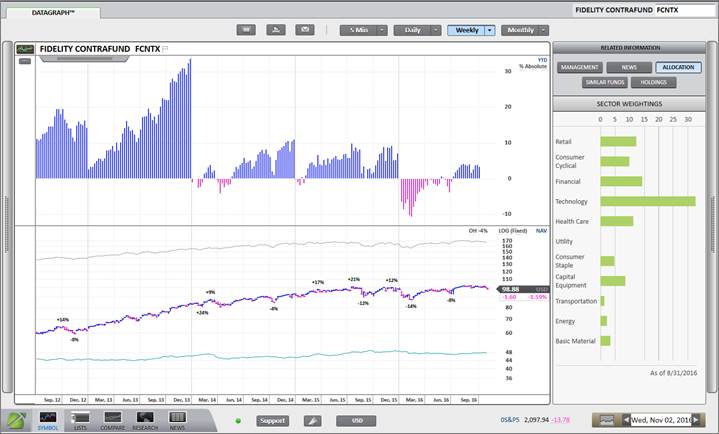
Summary Block
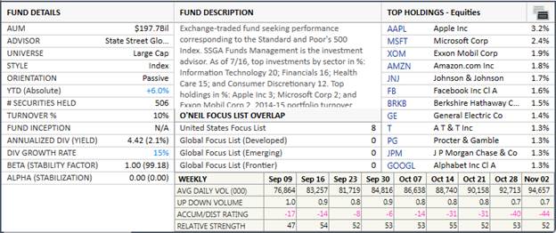
The Summary Block is optimized for mutual funds to show fund details, a brief fund description, and a summary of the fund’s holdings overlap with the O’Neil Focus Lists. It also includes a sample of William O’Neil + Co. Alphascope, a product that assesses portfolios to determine where the most alpha may be gained and lost.
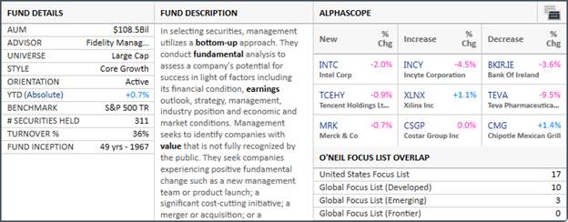
For more information on the full Alphascope product or the O’Neil Focus Lists, please contact William O’Neil + Co. Client Services.
NAV Menu
Customize the Datagraph through the NAV Menu located to the right of the chart.
Use the NAV Menu to edit or enable various lines and features of the chart.
Index Line
The Index Line on the Mutual Fund Datagraph chart uses Lipper’s assigned Fund Manager Benchmark that is determined by the fund’s prospectus.
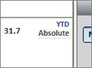
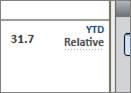
Absolute vs. Relative Performance
Click Absolute/Relative on the right side of the bar graph chart to toggle between seeing the fund’s absolute price performance and relative performance. Relative performance is calculated by comparing fund’s performance against Lipper’s Fund Manager Benchmark.
Fund Performance and Indicator Panels
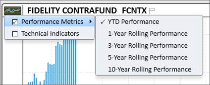
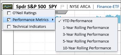
Click the small graph icon to the left of the fund name to see a dropdown of different available performance metrics and technical indicators.
Related Information (RI) Panel
The RI Panel is optimized for funds, showing pertinent information on the management, allocation, and holdings.
Management
The Management section gives information on the fund’s manager(s) including their title, photo, education, and other funds managed.
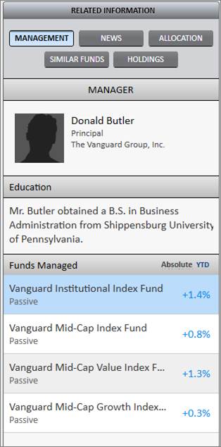
If there are other funds managed, click Absolute/Relative to toggle between seeing the absolute and relative performance. Click on the fund name to view its Datagraph.
News
The News section displays a news feed of articles about the fund or management.
Click the gear icon to edit the third-party news sources.
Click the refresh icon to refresh the feed.
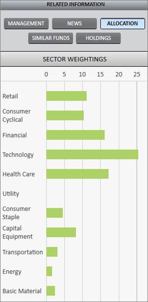
Allocation
The Allocation section displays a bar graph of the fund’s allocation by sector weight.
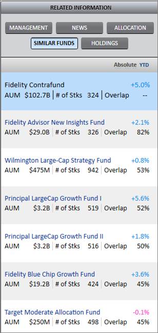
Similar Funds
Similar Funds is based on the last publicly reported holdings for the funds. The list is sorted in descending order by “holdings similarity”. To calculate the holdings similarity, we look at two factors: 1) the percentage of names that overlap between the portfolios and 2) the relative weight that each fund gives to those names.
Click Absolute/Relative to toggle between seeing the absolute and relative performance of that fund.
Click on a fund name to see its Datagraph chart.
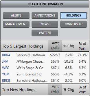
Holdings
The Holdings button shows the Top 5 Largest Holdings, Top 5 New Holdings, Top 5 Added Holdings, and Top 5 Reduced Holdings for the fund, and provides a link to view a comprehensive list of fund holdings in List Manager.
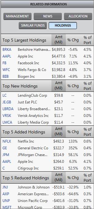
Click on a stock symbol to see its Datagraph chart.
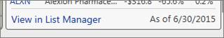
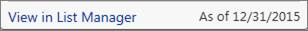
Click View in List Manager at the bottom of the panel to view a list of the fund’s holdings in List Manager.
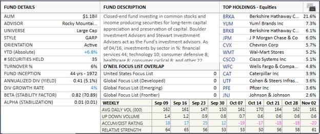
The Closed-End Fund Datagraph is optimized to view closed-end funds in PANARAY.
The default view shows a year-to-date (YTD) performance bar graph over a price chart.
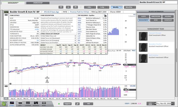
Summary Block
The Summary Block is optimized for closed-end funds to show fund details, a brief fund description, top holdings data, and a summary of the fund’s holdings overlap with the O’Neil Focus Lists. The closed-end fund Summary Block also contains a selection of weekly technical data.
Price Menu
Customize the Datagraph through the Price Menu located to the right of the chart.

Use the Price Menu to edit or enable various lines and features on the chart.
Fund Performance and Indicator Panels
Click the small graph icon to the left of the fund name to see a dropdown of different available performance metrics, O’Neil Ratings, and technical indicators. Place a checkmark next to an item to display it on the chart.
Related Information (RI) Panel
The RI Panel for closed-end funds is like the RI Panel for stocks, containing buttons like Alerts, Annotations, News, and Ownership. However, it also includes fund-specific information such as Management and Holdings.
Management
The Management section gives information on the fund’s manager(s) including their title, photo, education, and other funds managed.
Holdings
The Holdings button shows the Top 5 Largest Holdings, Top 5 New Holdings, Top 5 Added Holdings, and Top 5 Reduced Holdings for the fund, and provides a link to view a comprehensive list of fund holdings in List Manager.
Click on a stock symbol to see its Datagraph chart.
Click View in List Manager at the bottom of the panel to view a list of the fund’s holdings in List Manager.
The Exchange-Traded Fund (ETF) Datagraph is optimized to view ETFs in PANARAY.
The default view shows a small year-to-date (YTD) performance bar graph over a larger price chart.
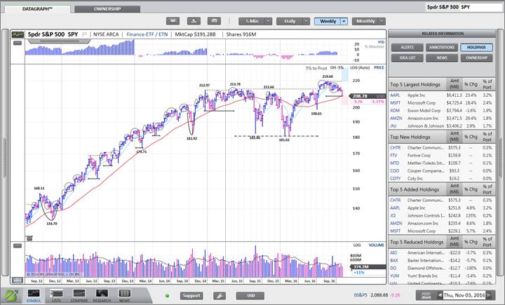
Summary Block
The Summary Block is optimized for ETFs to show ETF details, a brief description, top holdings data, and a summary of the ETF’s holdings overlap with the O’Neil Focus Lists. The ETF Summary Block also contains a selection of weekly technical data.
Price Menu
Customize the Datagraph through the Price Menu located to the right of the chart.
Fund Performance and Indicator Panels
Click the small graph icon to the left of the fund name to see a dropdown of different available performance charts and technical overlays. Place a checkmark next to an item to display it on the chart.
Related Information (RI) Panel
The RI Panel for ETFs is like the RI Panel for stocks, containing buttons like Alerts, Annotations, Idea List, News, and Ownership. However, it also includes ETF-specific information under Holdings.
Holdings
The Holdings button shows the Top 5 Largest Holdings, Top 5 New Holdings, Top 5 Added Holdings, and Top 5 Reduced Holdings for the ETF, and provides a link to view a comprehensive list of ETF holdings in List Manager.
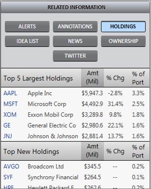
Click on a stock symbol to see its Datagraph chart.
Click View in List Manager at the bottom of the panel to view a list of the ETF’s holdings in List Manager.
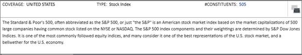
The Index Datagraph is optimized to view indices in PANARAY.
The default view shows a small year-to-date (YTD) performance bar graph over a price chart.
Summary Block
The Summary Block is optimized for indices to show various details including the index’s geographical area of coverage, type, number of constituents, and a summary.
Price Menu
Customize the Datagraph through the Price Menu located to the right of the chart.

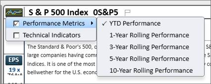
Index Performance and Indicator Panels
Click the small graph icon to the left of the index name to see a dropdown of different available performance metrics and technical indicators. Place a checkmark next to an item to display it on the chart.
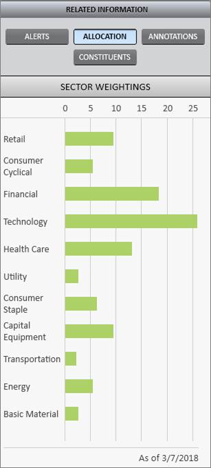
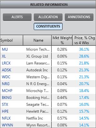
Related Information (RI) Panel
The RI Panel for Indices includes alerts, annotations, and index-specific information including Allocation and Constituents.
Allocation
The Allocation section displays a bar graph of the percentage weighting of each sector in the index.
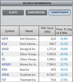
Constituents
The Constituents section shows the index constituents, weightings, and 4-week price performance. Constituents are sorted by 4-week price performance. Click on a symbol link to view the stock’s Datagraph.
The Sector and Industry Group Datagraphs are optimized to view sectors and industry groups in PANARAY.
The default view shows a small year-to-date (YTD) performance bar graph over a price chart.

Chart Heading
Industry Group Chart Heading
The Industry Group Chart Heading contains the group rank, group market capitalization, number of constituents, and sector.

Click on the constituents link to view a list of local or global constituents in List Manager.
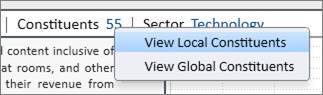
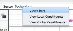
Click on the sector link to view the sector Datagraph chart, or a list of local or global constituents in List Manager.
Sector Chart Heading
The Sector Chart Heading contains the sector market capitalization and number of constituents.

Click on the constituents link to view a list of local or global constituents in List Manager.
Summary Block
Industry Group Summary Block
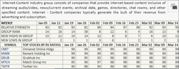
The Summary Block is optimized for industry groups to show various details including nine weeks of group-specific ratings, the top stocks in the group by Relative Strength, and a summary of the group constituents.
Sector Summary Block
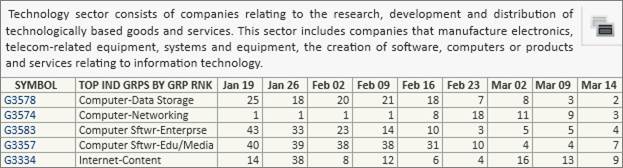
The Summary Block is optimized for sectors to show various details including the top industry groups by Group Rank, and a summary of the sector constituents.
Price Menu
Customize the Datagraph through the Price Menu located to the right of the chart.
Index Performance and Indicator Panels
Click the small graph icon to the left of the index name to see a dropdown of different available performance metrics and technical indicators. Place a checkmark next to an item to display it on the chart.
Related Information (RI) Panel
The RI Panel for groups and sectors includes alerts, annotations, and constituents.
Constituents
The Constituents section shows the group or sector constituents, market value, and 4-week price performance. Constituents are sorted by 4-week price performance. Click on a symbol link to view the stock’s Datagraph.
The Currency Datagraph is optimized to view currencies in PANARAY.
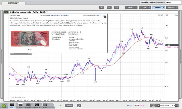
Summary Block
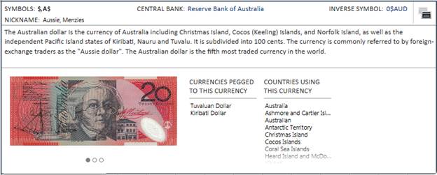
The Summary Block shows various details including the currency symbol, nickname, link to the central bank, and a link to the inverse O’Neil symbol. The block also shows a list of countries using the currency, and a sample of currency photos. If applicable, the block will list other currencies that are pegged to the current currency.
Price Menu
Customize the Datagraph through the Price Menu located to the right of the chart.
Use the Price Menu to edit or enable various lines and features on the chart.
Related Information (RI) Panel Annotations
The RI Panel includes the option to annotate the currency chart.
The Futures and Cash Spots Datagraphs are optimized for viewing futures and cash spots in PANARAY.
Summary Block
There is no summary block information available for futures and cash spots.
Related Information (RI) Panel Annotations
The RI Panel includes the option to annotate the futures or cash spots chart.
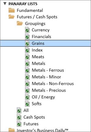
Futures and Cash Spots in List Manager
All available futures and cash spots can be found in List Manager under PANARAY Lists.